There are so many ways people view your website, sometimes redesigning or building a website can feel daunting to support all the physical screen sizes, screen resolutions and types of desktop, tablet and mobile devices. So where do you even start?
Fair warning tech and data science nerds! We’re writing this to help non-technical marketers who just want some basic guidance to help them make practical decisions. This article is purposely written to be general enough to aid the process, but not overly nuanced to where it’s hard to make sense of the information. We won’t be delving into all the filtering options and custom reporting that is possible, we’re just keeping it simple and high level.
Check Your Google Analytics Stats
More than likely, you’re probably working on a redesign of a website that already exists. With any luck, Google Analytics is already set up and has been running for some time. Skip this part if it isn’t. If it is, we feel the starting point is to check your Google Analytics for data to help your specific website. Before you begin, set the Google Analytics date range to encompass the past year if you have that much data. If not, go the maximum amount of time you have data captured.
Now…Lets see some examples of the reports you should check:
Device Category
This is the easiest one to digest and it will tell you a lot about how your web content is being viewed. Inside of Google Analytics, click on Mobile>Overview and it will show you the device category or what we think of as the 3 main types of devices; desktop (including laptop), mobile and tablets. It’s very easy to absorb.

Here we see that most views (at a whopping 78.8%) are coming from desktop/laptops. We can easily conclude that with most people visiting this website from a desktop and that supporting the desktop first world will be really important when planning your web design build.
Browsers
When you look at the browsers report, think about it primarily from the desktop/laptop frame of mind. For the most part, that is what is being reported on. In Google Analytics, simply go to Technology>Browser & OS. The default will be browsers.

In this case, Google Chrome captures 56% market share on the desktop/laptop views. Another clear winner and one to notate as part of the web build.
Screen Resolution
Another important consideration is the resolution of the screen viewing the website. This is pretty important, even in a “responsive” design. There are (even in 2021) still outer limits of what you can or want to support based on your budget and audience.
To view the screen resolution report we first need to find it. Again, like the Browsers report, you will go to Technology>Browser & OS where the default is the Browser tab. Then… look above the data for the little tabs of data you can click to.

From here, click on “Screen Resolution” to see the report.

Here we see that the vast majority of browsers are at 1024×768, which is a bit odd in the global perspective for 2021 (which we will cover later in the article), but it makes this particular data more valuable to us personally because the percentage is so significant.
Operating System
Knowing which operating system people are looking at can be helpful. Are they a Mac or PC crowd?
Like the Screen Resolution you will go to Technology>Browser & OS where the default is the Browser tab. Then… look above the data for the little tabs of data you can click to.
Then click on “Operating System” to see the actual operating system report.
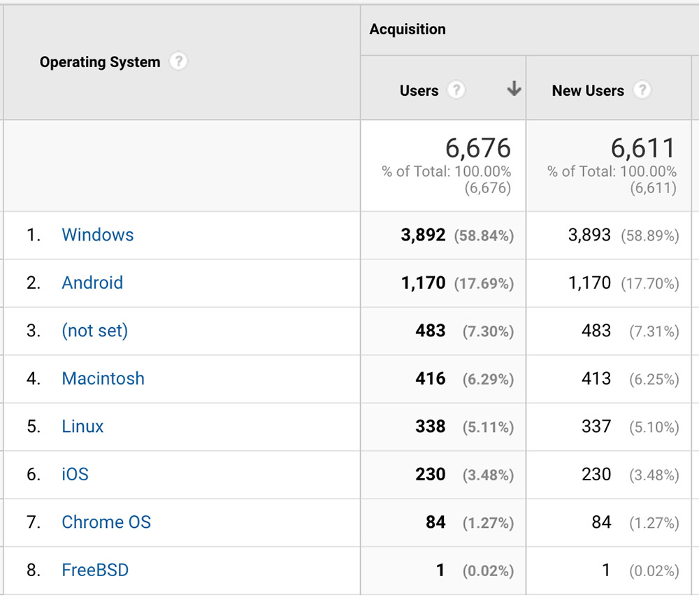
So this is an interesting note that Windows is the top OS, but Android is second with Mac being incredibly far behind.
A Note About (Not Set)
Not Set (in its simplest definition) is the inability of the analytic data to detect the particulars of the device/user viewing the website. There are way too many reasons to cover in this article, so we’ll write more on it in the future. Generally, it’s things like using VPN’s, private browsing, bots, etc. that contribute to this number. It sucks, but it is what it is and can’t be avoided very easily. Go with what you can see and unless the (not set) is a seriously significant percentage of traffic, then gloss over and keep moving forward.
Mobile Device Info (Optional)
Like the browser & OS report, If you want to get down to the specifics of the mobile devices, you can… but it may not be the most helpful information since there are likely to be so many. In any event, in Google Analytics if you go to Mobile>Devices you will see a list of devices.
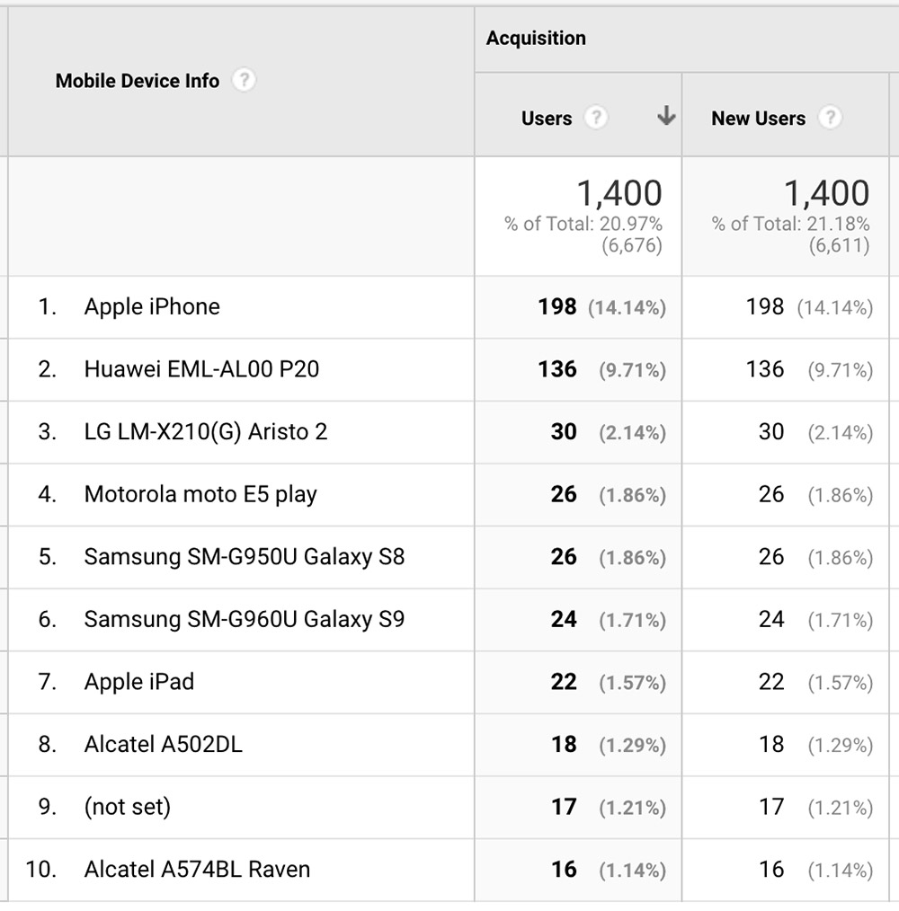
Keep in mind that there are two dominant OS’s in the mobile world in 2021, Android and iOS. You can easily see the stats from Apple and their iOS, however there are many types of Motorola, Samsung, LG phones that use the android operating system.
What we are really looking for here is anything that might stand out. Perhaps your audience is viewing your website from one type of phone that is dominating the stats. In our example above, there is no one dominant winner. More often than not, this report won’t change much about what you’ll support.
Summarize Your Findings
Okay, so we’ve pulled these reports and made some conclusions about our past traffic performance. From our examples here, what we would do is sum it up like this:
- The vast majority of visitors are running Windows operating systems on desktop, using chrome browser at 1024×768 resolution.
Yep…. it’s that simple. We’re pointing out what we should pay attention to on the redesign. You may conclude other examples. We may conclude other things as well if the stats support it. Maybe you notice an extremely high iOS usage or a very high screen resolution like 1920×1080.
Check Global Web Stats
Whether or not you have Google Analytics that can tell you specifics on your historical device stats, you should watch the latest on browser and device statistics from the organizations that aggregate and report on this. This part is super easy for you to get done, so here we go.
Two Great Resource Websites To Check Out
For years now, the interactive development team here at Right Here Interactive have relied on two websites to find global stats for devices, etc. They Include:
- Stat Counter – https://gs.statcounter.com. This site puts out great statistics, more than just device, browser, but also other stats on search and social media. They publish fantastic and filterable stats to get to the information you really seek. These are our go-to guys for stats and we’ll be showcasing their stats significantly more in the remainder of the article..
- W3 Schools – https://www.w3schools.com/browsers/default.asp – More than just statistics, W3Schools has tons of technical lessons and tools throughout. They’ve been publishing browser stats since 2002 and if you’re old like me, you know them well.
Desktop vs Mobile vs Tablet Market Share North America
As we can see this statistic published by Statcounter for April 2021 shows the Desktop barely edges out mobile 50-46%. Poor tablets coming in at paltry 3%. They’re not getting the love at all.
If your business or organization has a significant global presence, you may want to look at the global stats, which show mobile being significantly higher than desktop.
For those of you who did your Google Analytics exercise, is this different from your personal stats? In our example, it’s very different as we showed around 78% on the desktop. This is why we should always consult the great Google for stats relevant to us.
To get the latest stats, go to: https://gs.statcounter.com/platform-market-share/desktop-mobile-tablet/north-america
W3 schools does not have a comparable report to show.
Desktop Browser Market Share North America
As we can see this statistic published by Statcounter for April 2021 shows the Google Chrome is the force to be reckoned with with over 60% market share. That is a super majority. I am surprised to see that Safari on desktop is the second most popular.
For those of you who did your Google Analytics exercise, is this different from your personal stats? In our example, it’s very consistent as far as Chrome and inconsistent with Safari.
If your business or organization has a significant global presence, you may want to look at the global stats, which in this case shows Chrome having a slightly higher percentage.
To get the most updated stats, go to:
https://gs.statcounter.com/browser-market-share/desktop/north-america
Or you can try the W3 schools browser market share report at:
https://www.w3schools.com/browsers/default.asp
Screen Resolution Stats North America
As we can see this statistic published by Statcounter for April 2021 shows the 1920×1080 & 1366×768 are the dominant resolutions, but with a combined total of roughly 18%. In this case… it’s interesting to note that 1920 has only very recently become more dominant than 1366 which has been the leader for years. This trend will likely grow.
If your business or organization has a significant global presence, you may want to look at the global stats, which again shows fairly consistent information to North America.
So what do we do when there is no clear winner? Well, we take the averages of the top few stats to come up with a range. In April 2021, we can conclude that most browsers in North America run between 1280×760 to 1920×1080 and we can set this as a resolution testing range.
For those of you who did your Google Analytics exercise, is this different from your personal stats? In our example, it’s very consistent…. The inconsistencies.
To get the latest stats, go to: https://gs.statcounter.com/screen-resolution-stats/all/north-america
Or you can try the W3 schools browser display report at:
https://www.w3schools.com/browsers/browsers_display.asp
Operating System Market Share North America
As we can see this statistic published by Statcounter for April 2021 shows that around 50% are using the mobile devices, 34% on PC and a lowly 13% for Macs.
If your business or organization has a significant global presence, you may want to look at the global stats, which again shows fairly consistent information to North America.
So should you take a mobile-first approach to designing your website when 50% of traffic is on the two mobile devices? Yes and no. Modern responsive web design with most software lets you work from the desktop and change layouts as you work your way down from Desktop, to tablet to mobile. Your web designer (ahem… maybe try us perhaps) can show you more about it. The important part is you should test on mobile devices, real ones on your web project and make sure the experience is at least as good as it is on desktop. That’s a tall order sometimes, but keep your focus on it.
For those of you who did your Google Analytics exercise, is this different from your personal stats? In our example, it’s very different since we see the vast majority of traffic coming from desktop devices.
To get the latest stats, go to: https://gs.statcounter.com/os-market-share/all/north-america
Or you can try the W3 schools OS Platform Statistics report at:
https://www.w3schools.com/browsers/browsers_os.asp
Summing It Up
So we can sum up the statistics we found for general purposes. It looks something like this
- There is a tight split between mobile and desktop devices. The majority of people are on Android, iOS and PC’s. Android has significant mobile market share, albeit on many different devices. On the desktop side, people tend to be using Chrome running from 1280 to 1920 resolutions.
Now if you compare your personal findings with general North American statistics, you will notice some differences, particularly that our website is visited mostly by desktop. That’s the biggest difference from the general stats, yet one we we should take into account.
Drawing Your Conclusions On Device Support
So… what did we learn from these exercises? Well… generally speaking we can conclude that:
- Mobile device support is important, but it’s important that we test on mobile and desktop.
- We should test most heavily on Google Chrome on a Windows machine. Pro tip… Mac Chrome and PC chrome are almost 100% identical, so if it looks good on Chrome Mac, it should look good on Chrome PC.
- We need to test on multiple screen resolutions, primarily from 1024×768 to 1920×1080 with a historic sweet spot coming in at 1366×768. In a previous blog article, we covered Window Resizer to view at various screen sizes. Please consider it for your testing of resolutions.
I hope you’ll find the article helpful in where your mind should be when it comes to device support and you now have a little more clarity. Good luck on your project and please reach out to us if you need anything else!