If you are doing web design testing for your own or your client’s website, then you should check out this nifty little Google Chrome extension called Window Resizer. Window Resizer helps our team every single day we test web pages or entire websites.
NOT for mobile… or… not really anyhow
By the way… this article is purely for computer browser testing. When testing on mobile and tablet, we recommend you use actual device testing. I mean sure… it can give you some sense of how pages and content will look on a mobile device, but it isn’t accurate enough to replace device testing.
Side note… Our standard testing platform includes the iOS suite by Apple. While Android as an OS has more market share, we use the Apple products since they have the largest market penetration of any specific device.
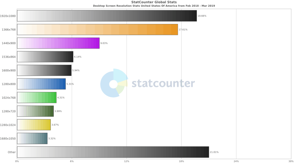
Bonus Tip: Common Browser Resolutions
So when you are testing web design and pages to see how they respond, you should keep in mind the latest browser resolutions. Generally we use the Stat Counter Global Stats. Here are the latest browser resolution stats for the USA for desktops:
Our Video Overview
Check out our YouTube video on Window Resizer that gives you a brief explanation of Window Resizer and how to use it. You’ll be up and running in no time.

Bottom Line
We love Window Resizer since it speeds up resolution testing for our entire team. We hope you will too. Please leave a comment if you have any other tools for browser resolution testing of your web design projects!