There are many different philosophies surrounding website development. One of the most popular is material design. Pundits will try to tell you that material design is a complex and thoughtful website development process.
In reality, material design is based on creating websites that embody real-life visuals to the everyday consumer. Material design highlights larger-than-life visuals and stresses website interaction for users.
Some of the best websites on the internet are based on this philosophy. While it may be challenging to understand all the details of material design, incorporating the philosophy is a pretty straightforward process.
But first, here are three things you should know about material design before you start putting a strategy in place.
1. Material Design is the Digitization of the Physical World
In the early days of the internet, most websites were influenced by skeuomorphic philosophies. To put it simply, websites utilized realistic icons and images to add a wow factor for their audience.
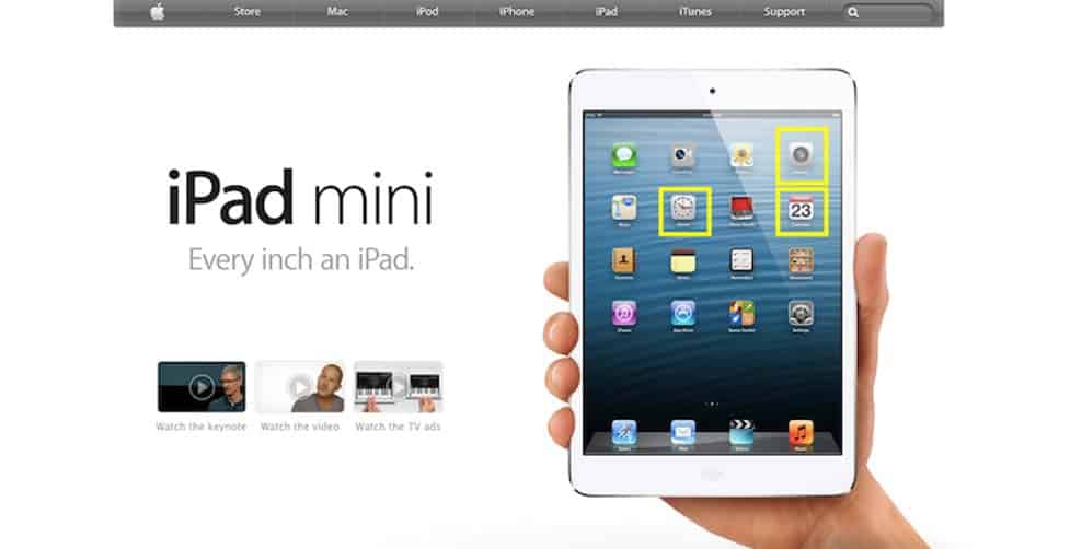
Check out what Apple’s homepage looked like back in 2012:

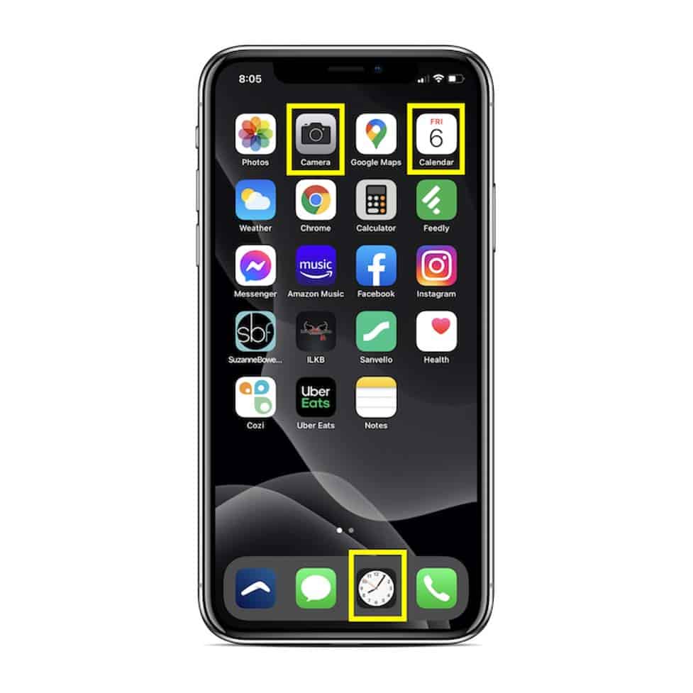
Of course, the image looks real. However, the definition of the image makes it hard to see the icons. Take a look at what this same image looks like on an iOS device in 2020:

The details of the icons are barely visible because the developers flattened the UI. As a result, this interface looks heavily unrealistic. On the other hand, material design supports real-world effects for digital images.
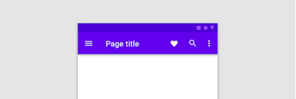
For example, take a look at the shadow underneath this menu:

This makes the menu stand out and adds definition to the entire interface. If you had to define material design, you could say that it involves adding real-life effects to a digital interface.
2. Material Design is Intentional
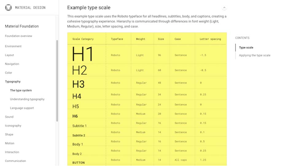
Websites influenced by material design utilize bold and graphic fonts. The philosophy states that there is a meaning and intention behind every font design choice. All of the following fonts are supported by material design:

No longer are websites using fonts just because they looked good or to follow a certain trend. Website developers are now focused on using fonts and graphics that evoke a response from their target audience.
3. Material Design Focuses on Motion
A lot of modern websites use animations to add a wow factor and captivate their audiences. In the same way, material design stresses that motion can be used to aid the end user.
However, there are certain principles you should abide by when using motion or any animations on your website:
- Motion should be used to let users know when and where they can take action. It should be a moving, interactive call-to-action (CTA).
- Motion should aid users on focusing on the most important parts of the web page.
- Motion should be expressive and add personality to an otherwise dull web page.
Are Websites Better with Material Design?
Websites engineering with material design are bold and authentic. In a world where modern consumers are picky and expect to interact with businesses in a real way, you’ll need this type of advantage.
If your agency could use some help in this area, we’d love to talk to you. Contact us today to learn more about how we can help.